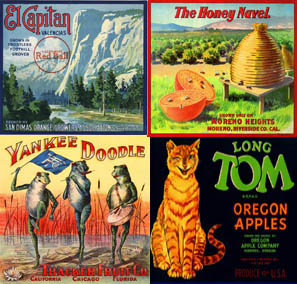
 fruit crate art courtesy of asliceintime.com
ephem ·era: paper items (as posters, broadsides, and tickets) that were originally meant to be discarded after use but have since become collectibles.
Vintage fruit crate art is oh-so-appealing––the vibrant color palette, the lovely shading of the fruit, the pretty backgrounds. And, best of all, produce crate labels combine two of our favorite things: fruit and art.
These kinds of fruit crate labels aren’t being printed any longer; instead, the vintage ones are hunted in the ephemera collectors’ market. But what’s still relevant about the labels that once adorned wooden crates full of fresh produce isn’t just the colorful paintings with their jazzy fonts and eye-catching names, it is that, in their day, they were an important form of food advertising and marketing.
In the 1870s, refrigerated rail cars (reefers) made it possible to ship fresh produce long distances. Suddenly, rural West Coast growers could get their wares to customers in major cities such as Chicago and New York, increasing visibility and access––but the growers had to figure out a way to make their wares distinctive.
Get tips for your office
Be an office hero!

Crate art collector and historian Paul Jarmusz has had an interest in label art since his childhood, which was spent near California citrus orchards. He began collecting and opened stalls at antique malls and festivals throughout the West.
Jarmusz paints a picture of how fruit crates functioned as a marketing method: “Most things people read back then were in black and white newspapers and books. Then, they’d go down to the Mom ‘n’ Pop store and the crates were fronted with beautiful, eye-catching pictures. The labels told stories of faraway exotic lands like California or Florida with their beautiful sunsets and luscious bounty.”
In American historian Kevin Starr’s book, Inventing the Dream: California Through the Progressive Era, he writes, “[The colors on citrus crate labels] went beyond nature and spoke directly to fantasy: apricot, purple, cobalt blue, sea green, cinnamon, cinnabar, mauve, yellow, orange.” The images the colorful labels created were vivid.
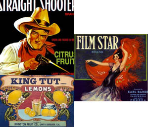
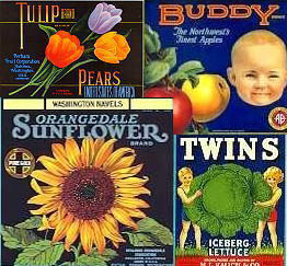
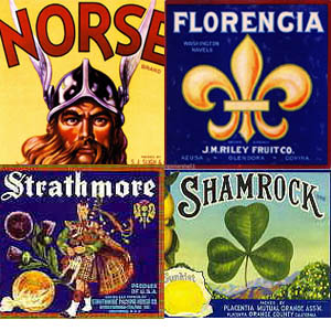
 fruit crate art courtesy of labelcollector.com
Another delightful aspect of fruit crate art is the variety of subject matter. Many early labels would feature flowers or cute children to appeal to the female shopper. Savvy growers tried to market to various demographics: if produce were going to Boston, a grower might try to appeal to the Irish by featuring shamrocks. South Philly would get Italian-themed art. And backdrops of the Sierras looking like the Alps were intended to appeal to German-American consumers.
Growers tried to strive for name recognition, too, says Jarmusz: “Groceries looked like they did in the TV show, The Waltons; [when] the mom would ask the clerk for items from behind the counter, she might remember her kids liked Piggy Pears and ask for them by name.”
The artists who painted most of the label art were by and large from Europe. Big lithographers like San Francisco’s Schmidt Lithograph placed ads in European journals and employed up to 100 artists at any one time. These artists rarely, if ever, received credit for these beautiful works of art.
The labels had to be printed on sturdy stock to handle the glue and the days in iced refrigerator cars. Back in the day, there were at least 30 printing houses and multiple box makers for the produce market. Salesmen traversed the fruitful lands selling labels, sometimes in panel trucks with a letterpress in the back and a stock of templates.
Growers were offered a myriad of choices, some from stock imagery, but many liked to feature their wives and children or something witty or topical. They chose subjects that referred to current events or celebrities. A cowboy squinting out of a Straight Shooter brand box resembled John Wayne and a label for King Tut Lemons likely followed the popularity of the 1922 Howard Carter discovery. In order for labels to be ready when the fruit was, the growers would purchase thousands of copies ahead of harvest. “Ordering and buying labels was a big step for these farm families,” reveals Jarmusz.

These days rarely does the retail buyer see the farmer’s fruit crates. Yet, branding is still paramount to the farmer for recognition from the wholesale market. “There are a lot of cool boxes,” says Beau Caillouette, lead buyer for The FruitGuys. “The coolest ones are the vintage ones.” But Caillouette doesn’t get swayed by a pretty box; his purchasing decisions depend on his experience with the fruit, “I buy from growers who I have a strong relationship with.”
More and more farmers are turning to reusable boxes; common now are plastic boxes that fold flat for shipping back to the grower. These boxes are eco-friendly, but they, unfortunately, don’t feature interesting labels.
The last big produce crate printing house, Schmidt Lithograph in San Francisco, was converted to condo lofts in the 1990s. But the labels live on as hot collectors’ items. Aficionados, like Jarmusz, have been able to find stacks of pristine unused labels in the old fruit packing houses that dot Oregon and California’s Central Valley. “Keep in mind these were Depression-era folks, they kept everything,” Jarmusz notes. Fruit crate art label fans have many styles and subjects to collect. “It’s nice because there is so much color, and people enjoy handling them. You can’t get that from a computer.”
If produce crate label art has piqued your interest, you’re in luck—the California State Railroad Museum is featuring a many of these vintage beauties in an exhibit called “Pick Me! A Bumper Crop from the Pacific Coast.” The exhibit runs through April 10, 2014. The museum is located at at the corner of Second and “I” Streets in Sacramento, CA.
Join the Chief Banana newsletter for weekly fruit facts, workplace wellness ideas, and occasional offers.
"*" indicates required fields
By signing up, you agree to receive emails from The FruitGuys. You can unsubscribe anytime.
Keep exploring.
Browse by theme.
Get easy recurring deliveries for break rooms, micro markets, and more.
Take advantage of faster checkouts and other great benefits.
Create an AccountWe are here to help you provide healthy food, meaning, and a reason to gather in your workplace.
From weekly mixed fruit for break rooms to monthly gifts for remote staff to special projects, we can serve your needs or turn your dreams into a nourishing reality.
Get fruit news, snack tips, and office wellness insights in your inbox each week, fresh from the desk of our CEO (aka Chief Banana)!
"*" indicates required fields

